Beer Label, take three!
Once the beer label was completed and submitted, we were assigned the next part of the three part process: to take a photograph and create an ad for the beer. I had a poster format to work with, and I wanted to keep it within the theme of Kings. I started brainstorming on what I would want to see in this ad, how I wanted it set up, and what kind of feeling I wanted to come from it.
The first step was to come up with a tagline. Thinking about poker, beer, drinking, and partying to start me off, I came up with a few ideas, but I settled on "For Real Players". The Kings line is a bold look, and is directed towards men who go out and do what they want, party how they want to, and always win when they play. Working with this tagline, coming up with a concept was easy, I decided to just stick with the poker theme.
I went and got a poker set for props, I wanted poker chips, the green mat and some playing cards to give it the most authentic feeling I could. I wanted to keep it dark, like a back alley poker game. Overall, I think the concept was very successful, and the picture turned out well.
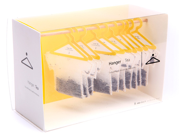
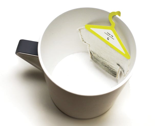
I thought I loved tea before, but if I could drink tea made out of these tea bags, I would enjoy it so much more! I love clever solutions like this; a tea bag like this is not only functional, but its incorporated in a wicked cool design. Designer Soon Mo Kang though of everything in this package design. The look of the tea bags themselves is awesome, how he shaped the bag itself like a shirt, and put it on a hanger instead of a string, which is probably the smartest tea idea; there's nothing worse then drinking tea and having the string get in the way every other sip. The packaging is also super cool, how he displayed the tea bags in a closet setting, with simple design touches added to it. The colour system works well too, the hangers and package match, and I'm sure if we saw the rest of the line, each tea would have a different colour, which makes the buying process easier. Overall, I think this package design is very successful.
Source: www.yankodesign.com
We all know I will take any excuse to distract myself from doing anything productive... so now its time to waste some time! Check out this link:
FlowerPower!
Enjoy friends!!
FlowerPower!
Enjoy friends!!
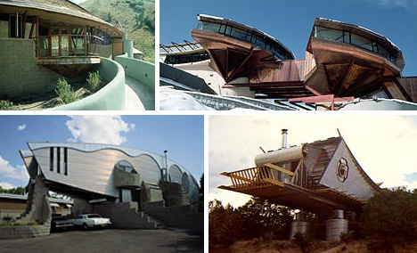
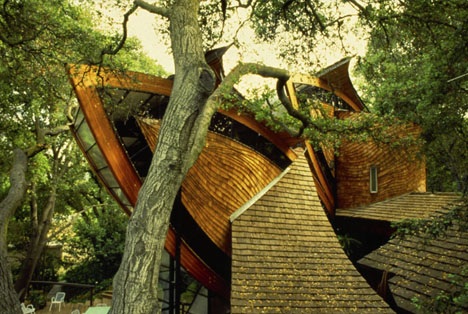
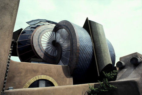
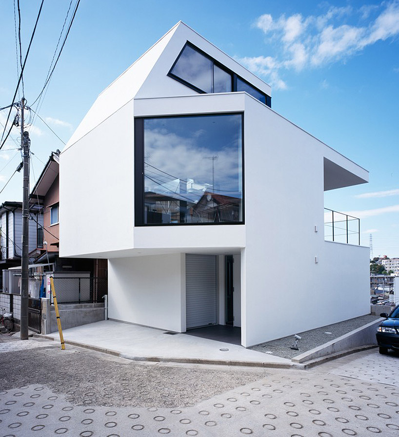
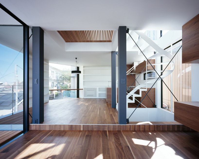
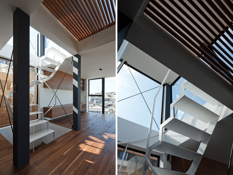
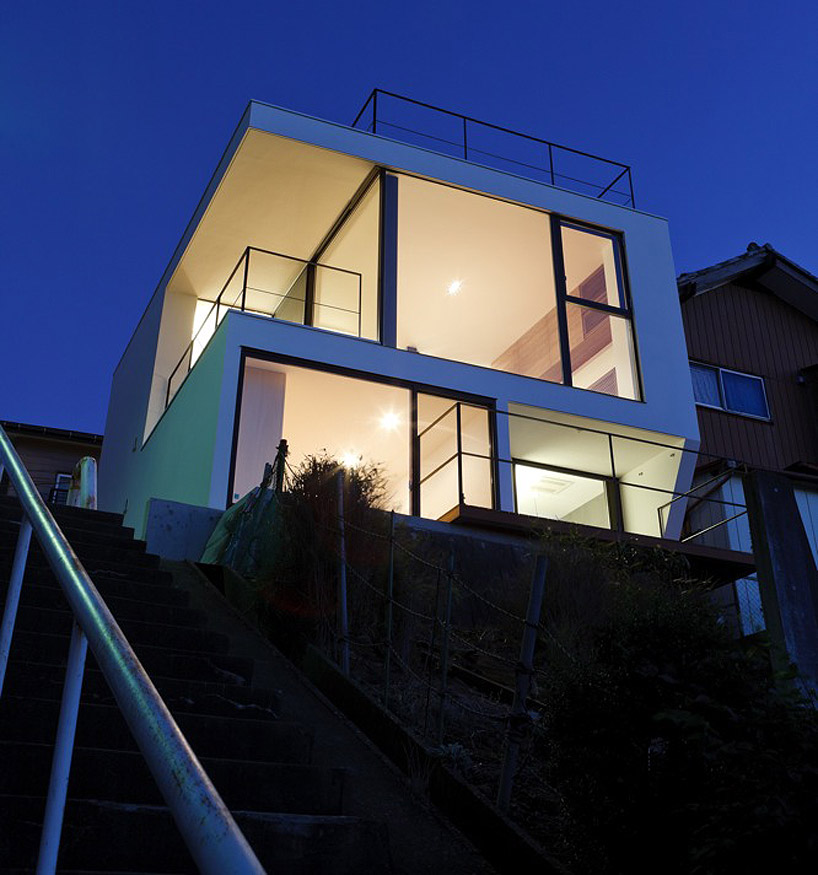
Now, we have to go back to one of the many houses I will own in my future... Architect Bart Prince is probably one of the most mind blowing designers I have seen in a while. Every single one of his buildings shows something completely different. From geometric angles, to organic curves and swirls, these buildings are like nothing I've ever seen before. When you think of a building, you think of a static form, that is built for function rather then fashion. Prince thinks on a whole different level. you can tell he thinks of the movement a building can have, how every angle looks different from surface to surface. Overall, these buildings are beautiful. Check out some more.
(source: dornob.com)
I recently stumbled across Round. design studio and have become extremely interested. Situated in Melborne, Australia this is a multi-disciplinary design studio who makes use of a variety of medias and creative outlets.The work features typographic solutions mixed with photography and geometric shapes. What really draws me into this body of work is that very little illustration is used, yet all of the design pieces have something about them that I love; which is extremely inspiring considering one of my weaknesses is my illustration, so seeing a design firm be this successful without needing the use of illustrations. Round's online portfolio consists of corporate identities, website design, commercial signage, packaging, book designs, editorial designs, and exhibition work. Personally, I really like the range in what the studio produces, from small business identities to the marketing to the L'oreal Melborne Fashion Festival in 2005, to work for smaller local editorial papers focusing on design. I am definitely inspired after viewing this website, and will look back to some of their designs for future reference when I am trying to come to a solution. Check out their website! or have a look at some of my favourites here...
source: http://www.round.com.au
Beer Label: take two!
I had to start thinking about the type solution I was going to use. I wanted something super bold and modern to offset the intricate lines in the cards. I chose the typeface League Gothic, a spin off of Trade Gothic. It was bold and uniform so it stacked well in the card shape.
I wanted the type to be a simple solution so that it wouldn't take away from the illustration, which I achieved by stacking all the copy in a square shape, and including the four suits in the beer's logo. I added the "K" to each of the corner to make it look even more like a card, with the white border around the label.
Then I had to consider the back, and how I was going to show the information required on a beer label. Because I was making a different label for 4 different beers, I wanted to have a short description for each of the beers, as well as the tag line for the brewery (Crown Lager). I chose to flip the label from the front, so that the image of the King was on the bottom of the label. That way, when placed side by side, the back and the front are mirror images of each other, like how they appear on a playing card.
This was how I handled the back. I used the same type face as the front for the Heading, the beer type. From there I needed a typeface that would handle the smaller body copy better, to be easier to read then the League Gothic was handling the smaller text. I chose the typeface Zag. It fit well with the the League Gothic, it was a simple modern sans serif typeface that didn't take away from everything else that was going on with the design of the card.
Beer Label: take one!
We were assigned a project to make a beer label, either a redesign of a current label, a brand extension of a current label, or a completely original company and beer. First off, this project sounds like the coolest project ever, I mean who doesn't like to look at beer?
Brainstorming through ideas probably took the most time throughout this process. I wanted something original that would attract the right audience. After several try-and-fails, I came up with the idea: Suicide Kings. Targeted towards a male audience, age 20-60, who enjoy casual drinking and hard partying in the right circumstance, who gamble on a regular basis; usually poker, and who like their beer. The entire label line is designed around the Kings in a deck of cards. I wanted to make it more then just one label, so I created a different concept for each King: a different type of beer for each of the four suits to make a sample pack for "real players".
Keep watching for the next part of this project!
We were assigned a project to make a beer label, either a redesign of a current label, a brand extension of a current label, or a completely original company and beer. First off, this project sounds like the coolest project ever, I mean who doesn't like to look at beer?
Brainstorming through ideas probably took the most time throughout this process. I wanted something original that would attract the right audience. After several try-and-fails, I came up with the idea: Suicide Kings. Targeted towards a male audience, age 20-60, who enjoy casual drinking and hard partying in the right circumstance, who gamble on a regular basis; usually poker, and who like their beer. The entire label line is designed around the Kings in a deck of cards. I wanted to make it more then just one label, so I created a different concept for each King: a different type of beer for each of the four suits to make a sample pack for "real players".
These are the images I came up with, I wanted an interesting look that was ornate enough to resemble a card, but still enough impact to make a man in my target audience to pick it up; which is where the skulls came into play. I used the traditional look of the Kings, but added skulls to the faces to work along with the Suicide Kings theme. The next step was to edit each of the scans so that they were usable, and to add some colour.
This is what I came up with, just flat swatches of colour to fill in the designs on the cards.Keep watching for the next part of this project!
Strengths and Weaknesses?
You know we all have them, stuff you're great at, brutal at, not good but not bad at, and stuff you can get away with when you absolutely have to. Personally, my biggest weakness in design is illustration. It's not something I truly enjoy doing, and when you don't love something you don't put your full heart into it, and the results show that. I enjoy illustrating ideas with other mediums instead, like working with photography, or type solutions. I don't think this weakness will hold me back in the future because of these options, I can work around this draw back and come up with some fantastic work in another field. In terms of my strengths, I feel like my ability to multi-task and manage my time is my strongest, I can take on a lot of different tasks and manage to complete them all with my full effort without becoming over whelmed. If you're looking for my biggest design specific strength, I would say typographic solutions. Its what I enjoy the most, so its what I am willing to invest the most time and effort into perfecting, which again: shows in the results.
You know we all have them, stuff you're great at, brutal at, not good but not bad at, and stuff you can get away with when you absolutely have to. Personally, my biggest weakness in design is illustration. It's not something I truly enjoy doing, and when you don't love something you don't put your full heart into it, and the results show that. I enjoy illustrating ideas with other mediums instead, like working with photography, or type solutions. I don't think this weakness will hold me back in the future because of these options, I can work around this draw back and come up with some fantastic work in another field. In terms of my strengths, I feel like my ability to multi-task and manage my time is my strongest, I can take on a lot of different tasks and manage to complete them all with my full effort without becoming over whelmed. If you're looking for my biggest design specific strength, I would say typographic solutions. Its what I enjoy the most, so its what I am willing to invest the most time and effort into perfecting, which again: shows in the results.
I took this portrait for first semester's Museum exhibit project. We were directed to create some print publication for a current, past, or completely fictional museum exhibit, which was to include a poster, a catalogue, a postcard, and some other giveaway, and then a trade show booth was added on after. I chose to feature Alexander McQueen, and the 2011 MET exhibit Savage Beauty. Working with his philosophies of design, and some of his current marketing for inspiration, I came up with this concept. I used Julia Hummel (Second Year Graphic Design student) as my model, and worked with her facial features to come up with a dramatic poster. Its successful because of the drama this image portrays, its Savage Beauty, a woman in her true form, McQueen believed that a natural woman was the most beautiful thing in the world, and thats what I worked with. I took it into grayscale, and smoothed out her face to get rid of any distractions. I then took the museum logo, and distorted it over her face to bring out the depth of her eyes. She's looking through the words, keeping your focus moving from the type back to her. I then added the feathers to tie in the rest of the exhibit pieces, as they were a focal point throughout the design system. This picture was simple enough to use on all of my pieces, yet visually interesting to feature on a poster and grab a viewers attention.
We were assigned a project last semester to research components of design and working with clients, and the topics that come up during the creative process. For the topic assigned, I had to compile some research on Spec Work, how it is viewed and its impact on the industry. I wanted to get a wide range of sources, so I got in contact with Sarah Grundy, a Conestoga College grad, who is now a Creative Director at MacLaren McCann. I called her and asked some questions, and this was the feedback I got.
Q. What are your thoughts on Spec Work? Do you support it, or are you against it?
A. As a member of the RGD, i support their view on spec work that they are against the use of spec work, it degrades the industry. No designer should do work for free just based on the chance that you might get the oppurtunity to do the work after you have already done the concepts for it. Personally, I think it’s not a positive evolution of the industry, spec work has turned design into a commodity, using crowdsourcing among designers is like making dogs fight over a bone.
Q. Have you ever seen an example of a successful use of Spec Work?
A. Spec work benefits the client, it does not benefit the designer, clients are using spec work to abuse the system and to get free business, so there is no way to create a successful career from doing spec work.
Q. What are your views of using spec work for educational purposes?
A. Spec work benefits the client, it does not benefit the designer, clients are using spec work to abuse the system and to get free business, so there is no way to create a successful career from doing spec work.
Q. What are your views of using spec work for educational purposes?
A. Using spec work for educational purposes is the only appropriate use, it is used to gain experience that students would not normally gain until they have graduated and found a job. But, once you have graduated this program and you have the credentials the program offers, you should be able to get a position that will pay you for your work. Clients should look for designers that have the ability to do what they need done, and move from there, the work should not be done first, with that decision made after, no designer should work for free.
Q. What do design firms have to offer to get around designers using spec work?
A.Most big design firms will have a range of designer positions from junior to senior, so when you are an unexperienced designer, you should be able to work within a junior position, so that you still get paid while you are recieving further education from more senior designers in the firm, the education should not come from doing spec work. Junior designers usually start with just tweaks and changes thet have to be done on bigger projects, so that they gain their experience in smaller chunks of projects. Junior designers are paid less then a senior designer, but they are still not working for free, which they would be if they were simply doing spec work.
A.Most big design firms will have a range of designer positions from junior to senior, so when you are an unexperienced designer, you should be able to work within a junior position, so that you still get paid while you are recieving further education from more senior designers in the firm, the education should not come from doing spec work. Junior designers usually start with just tweaks and changes thet have to be done on bigger projects, so that they gain their experience in smaller chunks of projects. Junior designers are paid less then a senior designer, but they are still not working for free, which they would be if they were simply doing spec work.
Alice Pasquini is based in Rome, is an illustrator, painter and set designer, and brings her work through streets in countries through Europe. She works with spray paint and acrylic, and her art adds colour and life to the streets of the cities she paints in. Take a look at some of her stuff!
Check out the rest of her work at www.alicepasquini.com!
The BIGGEST ever list of design resources!
This list has it all, I've used it several times when looking for inspiration, so I thought I'd share the wealth!
Enjoy
This list has it all, I've used it several times when looking for inspiration, so I thought I'd share the wealth!
Enjoy
This would take some patience...
I love finding the coolest things. This is a print, called the 'Tree of Life', a one colour ink print that at first glance looks like the trunk of a tree when its cut, but with closer observation you can see that each of these lines and shapes is made of tiny animals put together to form the image. It literally is the tree of life, one hundred percent organic!
Again, the amount of thought that would go into this concept blows my mind, the attention to detail making each animal shape fit into the line work around the tree would make me want to pull my hair out! I commend the designer that made this one!
(Source: ignant.de/)
I love finding the coolest things. This is a print, called the 'Tree of Life', a one colour ink print that at first glance looks like the trunk of a tree when its cut, but with closer observation you can see that each of these lines and shapes is made of tiny animals put together to form the image. It literally is the tree of life, one hundred percent organic!
Again, the amount of thought that would go into this concept blows my mind, the attention to detail making each animal shape fit into the line work around the tree would make me want to pull my hair out! I commend the designer that made this one!
Subscribe to:
Posts (Atom)


