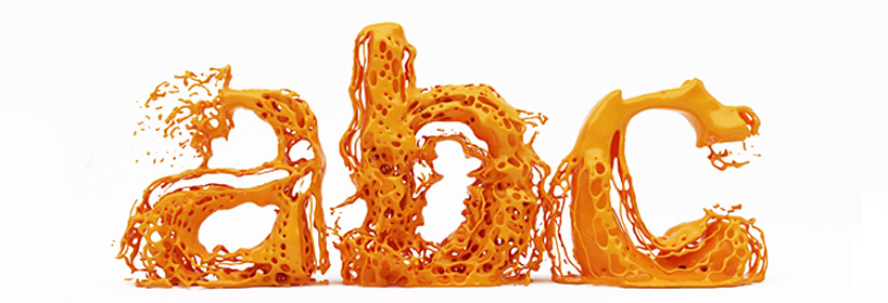
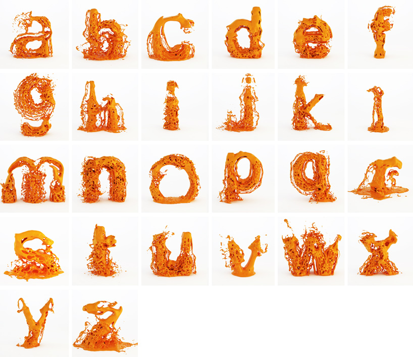
Speaking of experimental type...
"designed by hussain almossawi of bahraini studio skyrill design, 'fluid type' is conceptualized as a dynamic typeface,
in which each character in addition to being usable as a static letter has its own exploding animation." - designboom
We were just assigned an experimental typography assignment, to make a calendar focusing on type to show each month of the year. So in my visual research I came across this designers take on typography, and it's something I haven's seen before.
One thing that I take from using experimental type is to take an existing typeface and make it something that it's not normally, so taking a simple sans serif typeface and liquifying makes it so much more visually interesting. This new type is not for body text, or to be able to read something, this is add visual interest to your work. It forces the viewer to really look at what you've done and think about what the type actually says. I like the flow of the liquid within the letterforms, and the way it looks like it has just sprung into form. Take a look at some more examples and some videos to show the movement of the actual letters.
Have fun looking!
(source: designboom.com)