Whatever happened to you?


Wearing a bandaid has never been a stylish thing to do, but with these new bandaids, wearing one is now a talking piece! Not only has the designer of these thought of the redesign of the bandaids themselves, but also the tin package they come in. The look is perfect, although you know it is targeted towards a male audience, I'm still enticed by the idea, the package is clean and gets the message across right away, these are not ordinary bandaids! And the bright colours take them to the exact opposite of a usual bandaid, they're not the typical skin colour, they're bright vibrant colours with bold expressive type.

Now, I just need to know... Where can I get some of these??

source: www.gadget-o.com
Coca Cola Goes White

Coca Cola will change the iconic red can to a new white look featuring polar bears, to work with a new partnership with WWF, the World Wildlife Federation. This new campaign is part of some new initiatives the company has taken on to reduce environmental impact on climate and water. Coca Cola will donate $2 million to WWF over the next five years, and they will match $1 million in public donations.  The company has been featuring polar bears in its advertising since 1922, which was one of the main reasons for the focus. The full marketing campaign is called Arctic Home, and it will integrate advertising in newspapers, on television, on icoke.ca, as well as on packaging and in stores to raise awareness.

source: www.vancouversun.com
LGFW 2011

Fashion took over Toronto last week, as some of Canada's best designers showed their new Spring and Summer 2012 collections. The week took place in the David Pecault Square, right in the heart of downtown Toronto. Canada Cool is the theme for the weeks festivities, spotlighting Canada's most innovative and noteworthy designers.

The week features 40 different designers, all with 40 different styles, the amount of creativity packed into these five days is amazing... But I've gone through and picked out my top five designers from the week, based on how they design, what the design, and how much impact their designs have on me.

The first designer I loved this year was Arthur Mendonca, a Toronto based designer known the world over. His first collection appeared in 2002, and since then he has shown in New York, Montreal, Sao Paulo, London, and Los Angelos. His new Spring and Summer collection showed that the hem lines have dropped, and neck lines have gone up, with the exception of geometrical plunges. He works with classic and contemporary fabrics, mixing tweed with leather, using metallic details along trim lines for added interest. His colours range from neutrals like cream and brown, to splashes of colour on shoulder pieces and strips along the edges, to dramatic floral prints and loud full colour dresses. Mendonca uses geometric shapes throughout the collection, bringing the shape into his pocket structure, collar pieces, and cut outs on the necklines of his dresses. Overall, I love the collection, its wearable, but it's still fashion forward enough to stand out among the other designers that showed this week.

Arthur Mendonca's full collection

Lala Berlin is another designer I fell in love with this year, she opened the week right after Mendonca, she is one of the few non-Canadian designers featured this week, born in Tehran, she went to Berlin in 2001 and started her label. Originally she was a freelance editor, but she is now known through Germany as a designer who produces wearable garments that allow a woman's style to show through. The new Spring/Summer 2012 collection is everything I love about this years trends, but intensified. Menswear inspired silhouettes with a feminine twist. Boxy shapes made to fit with movable materials, pleating on waistlines of bottoms, men's dress shirts taken in to flatter a woman's curves, and boxy blazers topping off fitted pants. Her use of patterns is fabulous, working with the flow of the pattern to fit and shape her work, she adds interest to otherwise simple pieces, but still keeps the look classy enough to wear everyday.

Lala Berlin's full collection

Pink Tartan is a husband/wife partnership led by Kimberly Newport-Mimran, president and head designer. She started her career in retail (my kind of woman) working in several different positions, including buying, merchandising, product development, and her most passionate, design. I'll start by saying that aside from the clothes, Pink Tartan's styling for the show is one of my favourites, the looks are simplifies, natural hair, minimal makeup, and nothing flashy in the accessories, this really allows the design to stand out, and lets myself see how the everyday woman would wear the pieces. The design are fabulous, the dresses are simply shaped with added details to enhance the shapes, well tailored jackets add a strong shoulder to the models, fuller skirts are mixed in with clean a-line shapes showing the variety in shapes for the coming season, and the punches of colour throughout. Another one of my favourite things about this collection is how the actual fabric is used in the clothing, most of the pieces showcase the unique fabric used in a simple shape, to show the texture and interest just picking something with a ruffle or a stripe for instance. I would wear this line in a heartbeat, and that's something I look for when I view the designs at fashion week.

Pink Tartan's full collection

Amanda Lewkee, is one hundred percent an inspiration. She's young, only 22, and is fresh out of Ryerson, she graduated in 2010, which is ridiculously cool that she's already showing at Fashion Week. Her style is completely outside of the box, she uses patterned textiles that add depth to her pieces, making you look longer then you usually would to get the full concept. I love the idea of all her designs, even though I don't think I would wear many of her pieces. Her styling matches her work completely, the green visors add to the collection, without taking away from it, they just are a visual addition that makes you question what you are seeing even more. Overall, her designs are eye catching and make you want to know how she came up with what she did, and what she will come up with next. Lewkee has been named one of the new designers to watch, and this collection shows why.

Amanda Lewkee's full collection

Lovas, was launched in 2008 and is designed by Wesley Badenjak who is one of Canada's new rising designers. With this collection, I've gone back to the wearable creative. He works with colour block swatches, rich full colour designs, and classic neutrals, all while keeping the looks classic and clean. His styling is the only think I would question, the use of Native head pieces and jewelry isn't something I would necessarily pair with the looks he's presented, I feel like it takes away from the lines and class of the collection. Styling aside, the collection is another one I would easily wear, yet it still shows the fashion forward thinking a designer needs to show to stand out in this group of talent.

Lovas's full collection

There are many more incredibly talented designers that took their turn on the runway last week, and yo can check out the full list of collections on the , I use everything I see as inspiration for the next thing I do, and yo can always find inspiration from a group of designers like this.
Nokia has created the worlds largest stop motion animation, and the best part: the entire thing was shot with three Nokie N8 phones. Check out the animation:


Want to know how they made it? Check out this second video:


Absolutley amazing! For more information on how this was all done, and why, check out Fast Company to get some more details.


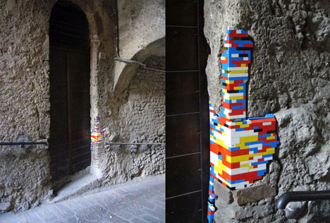
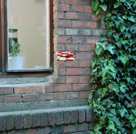
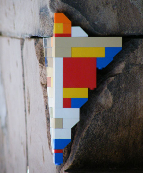
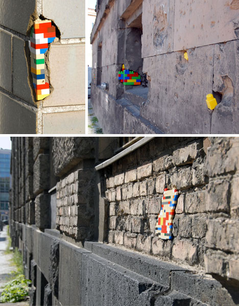
Dispatchwork...

Check this out:
Jan Vormann has taken this architecture, looked at the wear and tear, and filled it in with tiny brightly coloured bricks. Lego, in the place where sometimes century old bricks and other materials have given way to elements and age, taking the old and making it modern. This is an urban art installation makes appearances in Berlin, and its partly highlighting historical buildings (many of the gaps are from World War 2) and partly calling attention to some of the buildings in the city that can use some work. His process is harder then it looks, first Vormann has to find the cracks he wants to fill, an important decision, and a completely subjective one, and then he has to work with the structure of the the crack, using details like corners to fill them all in.
The concept about this is so interesting, using something like Lego and placing it in an environment as opposite as this is beautiful. The juxtaposition of old and new is extremely eye catching, and its something that would make you stop and stare, to figure out just what it is, and how someone could come up with something so creative. And the hidden message behind the bricks, to point out the beauty of the city, its rich heritage and history, while showing the people who maintain the city that there are things that need some TLC is impressive, because really, the Lego draws you in, and the landscape makes you think.
 More cool packaging brought to you by, Andrew Seunghyun Kim...


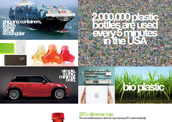
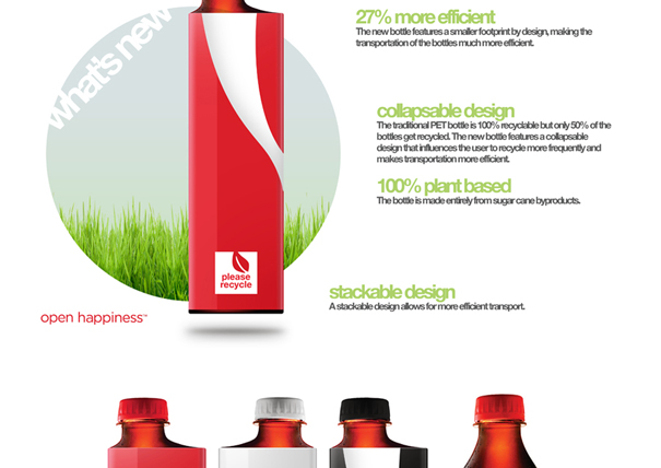
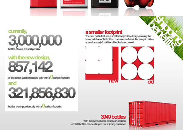
Check this out.. Designer Kim has taken eco-friendly packaging to the next level, I'm just going to post his entire design proposal and let it tell you all the details...

Mixing sustainability with just a really good idea, it really can't get much better... I love the simple genius behind this idea, the new square shape, the slightly offset cap and the crazy smart way they stack together. Every time I see something like this, and idea this cool, I love to make note of it, keep it in the back brain... you never know when this inspiration will come in handy!


D*Face

A group of skateboarders have taken painting to a whole new level. Crazy as it sounds, they've strapped spray paint cans to the bottom of skateboards, painted a pool white, and gone nuts. Each board shows each skaters style and movement, with remote triggers they can control when and how much they spray as they work their way through the pool. With each of skaters having a different style, and different tricks, the pool is filled with a crazy geometric design.

Designing outside the box much! I love the thought that went behind this, taking two passions and showing them on one 'canvas'. Here's some pictures, and the video showing the whole thing...


50 things every graphic design student should know...

1. You are not the first.
2. There is always someone better.
3. Success is not a finite resource.
4. You cannot score without a goal.
5. Starting anything takes energy.
6. The path to work is easier than you think.
7. Have a positive self image.
8. Get a clean, simple website up.
9. Curate your work.
10. Listen to your instincts.
11. Make your work easy to see.
12. Hand-write addresses.
13. Never take an unpaid internship.
13. Time is precious - get to the point.
15. Do as many internships as you can stand.
16. Don't waste your internship.
17. Make friends with a printer.
18. Find your local D.I.Y. store and dollar store.
19. Be patient.
20. Ask questions.
21. Ask for opportunities.
22. Seek criticism, not praise.
23. Make friends, not enemies.
24. News travels fast.
25. Don't get drunk at professional events.
26. Network.
27. Dress smart - look business like.
28. Never work for free.
29. Negotiate if you have to.
30. Read contracts.
31. Make your invoice stand out.
32. There's no such thing as a bad job.
33. There's no such thing as a bad client.
34 Embrace limitations.
35. The environment is not a limitation.
36. Boring problems lead to boring solutions.
37. New ideas are always 'stupid'.
38. Do not underestimate self-initiated work.
39. Justify your decisions.
40. Show sketches, not polished ideas.
41. Work with the client, not against them.
42. Don't always take no for an answer.
43. Pick your battles.
44. If you're going to fail, fail well.
45. Be an auteur.
46. Take responsibility for failure.
47. Share your ideas.
48. Get out of the studio.
49. Awards are nice, but not vital.
50. Don't take yourself too seriously.

Check out the full list by Jamie Wieck, he goes more in depth on each of the points with some neat illustrations to go along.