Vacation house...
After finding the place I will live for most of the year in Thailand, I've found my vacation house in Madrid, Spain. And this one takes that top spot less because of location, and more for design. This house is one hundred percent round, a full 360 throughout the entire design. It is beautiful, and innovative; and another one of the many things that make me ask: Where do I get one?!
Nerdy Dirty, illustrations for nerds in love
This adorable little love illustrations are for the nerd I know is hidden deep inside every single on of us! It reminds me of the Big Bang Theory, the show that gets me through most projects, so it makes me love these even more. I love the use of flat washes of colour, with the small uses of typography in each of them just to add a little bit of humour to each of the illustrations.
source: www.dailyinspiration.nl
wonder-wall.com
Another website to blow your mind... and once you get past the sheer genius of their website design (and its extremely effective distracting techniques... I've been looking at it for an hour now...) you can check out their insanely modern and beautiful interior, architectural and product design. Now, go forth and have fun with this site!
Another website to blow your mind... and once you get past the sheer genius of their website design (and its extremely effective distracting techniques... I've been looking at it for an hour now...) you can check out their insanely modern and beautiful interior, architectural and product design. Now, go forth and have fun with this site!
My future house...
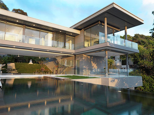
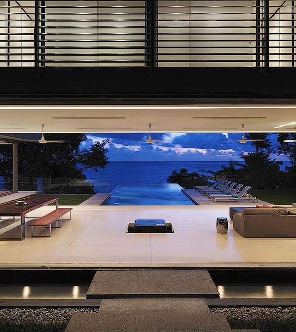
Sorry everyone, I think I'm going to have to leave, I'm moving to Phuket, Thailand. This villa is built into the granite rock face, and shows panoramic views of the Andaman Sea. Modern design at home in natural beauty.
Designed by Adrian McCarroll, Waiman Cheung & Jamie Jamieson.
Sorry everyone, I think I'm going to have to leave, I'm moving to Phuket, Thailand. This villa is built into the granite rock face, and shows panoramic views of the Andaman Sea. Modern design at home in natural beauty.
Designed by Adrian McCarroll, Waiman Cheung & Jamie Jamieson.
source:www.yankodesign.com
Fashion mixed with industrial or geometrical environments is something I respect and enjoy.
It brings the beauty of the person, and what they are wearing to the forefront, while increasing the awareness of thought about the picture. All round, beautiful.
source: www.mladenpenev.net
The evolution of logos
The Apple Logo, revolution. It takes you back to the original logo of Sir Isaac Newton sitting under the apple tree, and I'm sure he had no idea what the apple would become... a multi-billion dollar corporation with some of the best designs out there.
Again, another huge company, all about brand recognition. Its hard to believe that the logo has changed this much, and then gone back to something so similar to the original. The third logo is a shake my head moment, as in what were they really thinking with this, but they brought it back with the next design, and even more so with the most current. It just goes to show you that design follows trends just like everything else: if its good, it will come back into style.
And for my final example of logo evolution... IBM. This just shows a change in name and logo can work together really well. The first two are questionable on their intent, I have a hard time reading them, or getting anything out of them. I'm not sure whether is because I don't recognize the company, but I think it has a nice look with the lines and shapes, but is not effective as a logo. Working from there, the third has a cool concept, but is still hard to read in this small form. Going to the fourth, we are close to the current logo, with the simple use of typography to state the name of the company. I like both the fifth and sixth logo; they are clean and simple and recognizable, just like a logo should be.
source: www.inc.com
'like'
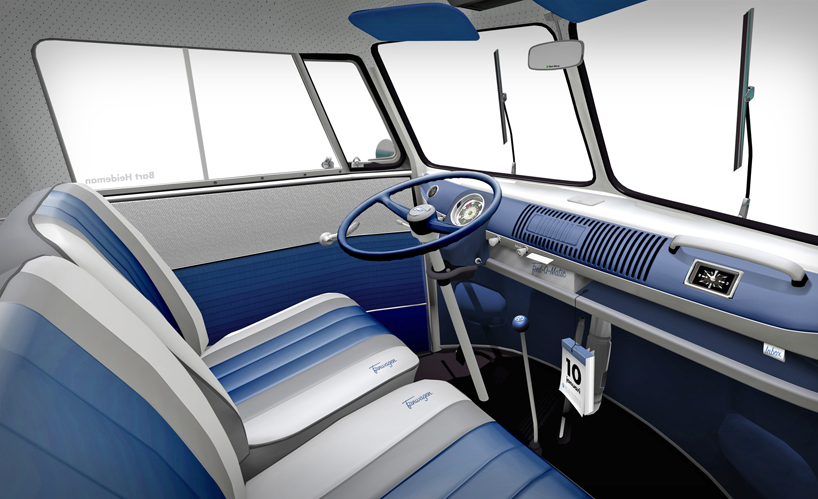
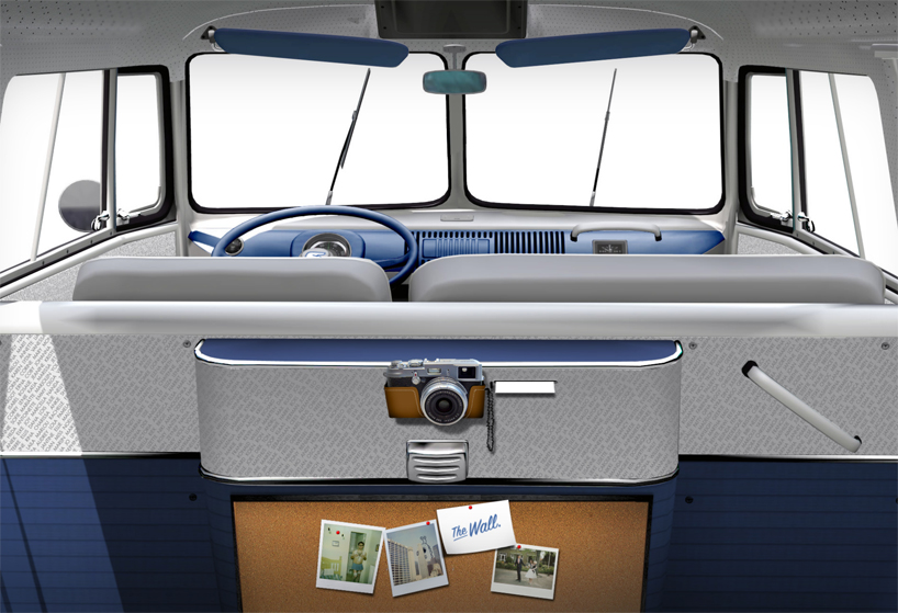
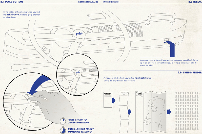
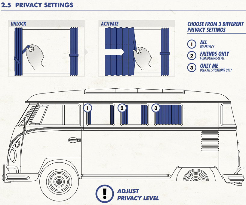
Volkswagen the Netherlands has taken the Volkswagen T1 bus and turned it into a Facebook advertising vehicle. It is one hundred percent Facebook, with different add ons and functions to fill every one of our Facebook-addicted selves needs. On the dashboard, this 'Fanwagon' features the 'feed-o-matic', a device that can print off the last ten post's of the drivers news feed, while only pushing one button. The rear license plate has a small scroll wheel to change the driver's relationship status, and come on, who wouldn't want to know then when you're driving? There's also a map in the car that can be programmed to show the locations of all the driver's friends... hello?... never use a gps again!
Some of the other features just play off a normal car's features; the horn is a 'poke' button, and within the manual it is "made to grasp the attention of other drivers". The door handles have labels that say "add friends", which is true: if I let you in my car, you either are or will be my friend! The glove compartment, or "inbox" is a 'feature' to "store all of your private messages"; with instructions included in the manual "to remove a message, take it out of the inbox". The user's manual also comes with instructions for privacy settings... 'all' (window curtains all the way open); 'friends only' (the curtains are to be pulled halfway); and 'only me' (the curtains are now shut). The rearview mirror is now the 'chat mirror' to "live chat with friends in the back seat: look in the mirror to see available friends, and select a specific friend by adjusting the angle of the mirror".
This design extremely well thought out, every little detail in the vehicle ties into the typical Facebook user perfectly, and lets all admit it, even if its not Facebook, every single one of us overuses a social networking site at least once in our lives. So its extremely applicable to most people. Now, my only question is: where do I get one?
source: www.designboom.com
Scrabble takes on typography
This intense game of scrabble was designed by Andrew Capener. It was brought to life while he studied his last year at BYU, and it gives players a chance to mix up the boring old game of scrabble by adding new typefaces to each word. It makes the game so much more creative, with a crazy mix of letters in each word. I don't usually enjoy scrabble, I feel like I can never actually win the game, but with this game, who knows how much fun I would had? A new design can add a new perspective to just about anything.
He took the time to make the board out of solid walnut, with the pieces magnetized to stick together. The bottom of the board is lined with non-slip cork, and the entire system fits into a birch box.
I think this take of the game scrabble is really innovative, I really enjoy it when someone can take something known and trusted and spin it into something of a higher value and increase the interest at the same time. It's a beautiful piece that any collector, or just an everyday person would want on their coffee table.
source: www.design.is
Ten Steps, to becoming the designer you want to be
I like lists like this, they make you think about what you need to do, where you need to go, and how you're going to get there. Finding websites like this is always great, you never know what they will come out with after the first list.
1. Get the book
We all have a book that grabbed us by the throat and never let go, forever changing how we look at our profession. For me, that book was Sparks of Genius, The Thirteen Thinking Tools of the World's Most Creative People. The design process is, ultimately, the ability to creatively solve problems-and in our profession, we need to be better at it than most.
2. Get the obscure book you've never heard of
While it's an older book, The All New Universal Traveler – A soft-systems guide to creativity, problem solving and the process of reaching goals is still juicy today. It was written by architecture professors from California Polytech and the School of Architecture and Environmental Design, and presents a ton of research condensed into a tightly packed form.
3. Choose a topic that fascinates you and learn it inside out
This is how you become an expert. Your topic might be as broad as sustainability, or as narrow as a specific method like body storming. Over the last 10 years, I took on three provocative topics-emotional design, design research, and participatory design-and I just recently look on another: synesthesia.
4. Write, blog, and speak on that topic
You're an expert once you feel comfortable calling yourself an expert. Take Jakob Nielsen, who began blogging about usability back in the late 1990s. He became recognized as the source on usability because he was consistently churning out information on the topic. Were there other experts on usability? Sure. But Nielsen developed the early point of view, and wrote provocatively about the subject.
5. Learn Something New Every Day
Every designer should be on a quest to see the world with fresh eyes every day. This might be learning something-a bit of trivia, perhaps-that helps you see the world a little differently. For example, today I learned that cats can't taste sugar. This may sound trivial, but it could lead to a whole host of ideas. And so could the fact that they have hooks on their tongue to lap up water.
6. Create a New Idea Every Day
At one point I was twittering a new idea every day. (Example: "Product Idea #1: Skin Pens > did you ever write notes on your hand? i still do. i want a pen for skin writing on the go.") Now I file them manually. People will say that ideas are a dime a dozen, but I think they're wrong: I think the first 10 might be worth a dime, but the last two could be worth their weight in gold. I would suggest that the designer without an idea isn't a designer. Record them, capture them, and go back to them.
7. Experiment
Good designers experiment. One of my favorite examples is from fellow frog Michael McDaniel, who conceived of portable housing after Hurricane Katrina. When he didn't get immediate interest from government agencies, he built a full prototype in his backyard. I've experimented with measuring emotion through sound, and a scent alphabet, to name a few. When you do experiment, push the edges.
8. Learn as many frameworks as you can
In 2008, a design team at M3 (where I was working at the time) went through 400 design research methods, reduced the redundancy, and then sorted the remaining 250. This exercise, while daunting, was incredible: For the first time, a designer could see the research methods, or "frameworks," that existed in the design space. The point is, you should get comfortable moving beyond just brainstorming and start structuring data in such a way that it drives insight and innovation. When you get comfortable with many frameworks, you'll start creating your own. The only caveat is not to rely on them, because not everything can be modeled in a framework that already exists.
9. Choose variety over anything else
I turned down an offer that paid more to come work at frog. I've never regretted that decision. If anything, frog has made me crave variety in such a way that I doubt I'll ever be able to commit to just one industry. I've done everything from cell phone interaction design to social networking strategy, and from the future of electric vehicles to emotional medical identification. I would recommend to anyone that when you stop learning, it's time to move on.0
10. Model or draw (all the f*@#ing time)
To be good at anything, you need to do it a lot. And to be really, really good, you need to do it all the time. I don't care how great an idea is, if you can't model it, prototype it, or draw it, then you're screwed. If you learn nothing else from this blog post, please find a way to learn how to make your ideas tangible. This can be through graphic design, sketching and rendering in Alias, a flash prototype, photography, video, whatever. Just learn the tools of the tangible.
(source:www.good.is)
Check this out... visualdata.org
I love interactive websites, and this one has several levels of ways to interact. Check through the series of pages at the bottom, each one is a different program to work with. The only problem is, its not a great site to find when you have too much to do!
I love interactive websites, and this one has several levels of ways to interact. Check through the series of pages at the bottom, each one is a different program to work with. The only problem is, its not a great site to find when you have too much to do!
Whatever happened to you?


Wearing a bandaid has never been a stylish thing to do, but with these new bandaids, wearing one is now a talking piece! Not only has the designer of these thought of the redesign of the bandaids themselves, but also the tin package they come in. The look is perfect, although you know it is targeted towards a male audience, I'm still enticed by the idea, the package is clean and gets the message across right away, these are not ordinary bandaids! And the bright colours take them to the exact opposite of a usual bandaid, they're not the typical skin colour, they're bright vibrant colours with bold expressive type.
Now, I just need to know... Where can I get some of these??
source: www.gadget-o.com
Coca Cola Goes White
Coca Cola will change the iconic red can to a new white look featuring polar bears, to work with a new partnership with WWF, the World Wildlife Federation. This new campaign is part of some new initiatives the company has taken on to reduce environmental impact on climate and water. Coca Cola will donate $2 million to WWF over the next five years, and they will match $1 million in public donations. The company has been featuring polar bears in its advertising since 1922, which was one of the main reasons for the focus. The full marketing campaign is called Arctic Home, and it will integrate advertising in newspapers, on television, on icoke.ca, as well as on packaging and in stores to raise awareness.
source: www.vancouversun.com
LGFW 2011
Fashion took over Toronto last week, as some of Canada's best designers showed their new Spring and Summer 2012 collections. The week took place in the David Pecault Square, right in the heart of downtown Toronto. Canada Cool is the theme for the weeks festivities, spotlighting Canada's most innovative and noteworthy designers.
The week features 40 different designers, all with 40 different styles, the amount of creativity packed into these five days is amazing... But I've gone through and picked out my top five designers from the week, based on how they design, what the design, and how much impact their designs have on me.
The first designer I loved this year was Arthur Mendonca, a Toronto based designer known the world over. His first collection appeared in 2002, and since then he has shown in New York, Montreal, Sao Paulo, London, and Los Angelos. His new Spring and Summer collection showed that the hem lines have dropped, and neck lines have gone up, with the exception of geometrical plunges. He works with classic and contemporary fabrics, mixing tweed with leather, using metallic details along trim lines for added interest. His colours range from neutrals like cream and brown, to splashes of colour on shoulder pieces and strips along the edges, to dramatic floral prints and loud full colour dresses. Mendonca uses geometric shapes throughout the collection, bringing the shape into his pocket structure, collar pieces, and cut outs on the necklines of his dresses. Overall, I love the collection, its wearable, but it's still fashion forward enough to stand out among the other designers that showed this week.
Arthur Mendonca's full collection
Lala Berlin is another designer I fell in love with this year, she opened the week right after Mendonca, she is one of the few non-Canadian designers featured this week, born in Tehran, she went to Berlin in 2001 and started her label. Originally she was a freelance editor, but she is now known through Germany as a designer who produces wearable garments that allow a woman's style to show through. The new Spring/Summer 2012 collection is everything I love about this years trends, but intensified. Menswear inspired silhouettes with a feminine twist. Boxy shapes made to fit with movable materials, pleating on waistlines of bottoms, men's dress shirts taken in to flatter a woman's curves, and boxy blazers topping off fitted pants. Her use of patterns is fabulous, working with the flow of the pattern to fit and shape her work, she adds interest to otherwise simple pieces, but still keeps the look classy enough to wear everyday.
Lala Berlin's full collection
Pink Tartan is a husband/wife partnership led by Kimberly Newport-Mimran, president and head designer. She started her career in retail (my kind of woman) working in several different positions, including buying, merchandising, product development, and her most passionate, design. I'll start by saying that aside from the clothes, Pink Tartan's styling for the show is one of my favourites, the looks are simplifies, natural hair, minimal makeup, and nothing flashy in the accessories, this really allows the design to stand out, and lets myself see how the everyday woman would wear the pieces. The design are fabulous, the dresses are simply shaped with added details to enhance the shapes, well tailored jackets add a strong shoulder to the models, fuller skirts are mixed in with clean a-line shapes showing the variety in shapes for the coming season, and the punches of colour throughout. Another one of my favourite things about this collection is how the actual fabric is used in the clothing, most of the pieces showcase the unique fabric used in a simple shape, to show the texture and interest just picking something with a ruffle or a stripe for instance. I would wear this line in a heartbeat, and that's something I look for when I view the designs at fashion week.
Pink Tartan's full collection
Amanda Lewkee, is one hundred percent an inspiration. She's young, only 22, and is fresh out of Ryerson, she graduated in 2010, which is ridiculously cool that she's already showing at Fashion Week. Her style is completely outside of the box, she uses patterned textiles that add depth to her pieces, making you look longer then you usually would to get the full concept. I love the idea of all her designs, even though I don't think I would wear many of her pieces. Her styling matches her work completely, the green visors add to the collection, without taking away from it, they just are a visual addition that makes you question what you are seeing even more. Overall, her designs are eye catching and make you want to know how she came up with what she did, and what she will come up with next. Lewkee has been named one of the new designers to watch, and this collection shows why.
Amanda Lewkee's full collection
Lovas, was launched in 2008 and is designed by Wesley Badenjak who is one of Canada's new rising designers. With this collection, I've gone back to the wearable creative. He works with colour block swatches, rich full colour designs, and classic neutrals, all while keeping the looks classic and clean. His styling is the only think I would question, the use of Native head pieces and jewelry isn't something I would necessarily pair with the looks he's presented, I feel like it takes away from the lines and class of the collection. Styling aside, the collection is another one I would easily wear, yet it still shows the fashion forward thinking a designer needs to show to stand out in this group of talent.
Lovas's full collection
There are many more incredibly talented designers that took their turn on the runway last week, and yo can check out the full list of collections on the , I use everything I see as inspiration for the next thing I do, and yo can always find inspiration from a group of designers like this.
Nokia has created the worlds largest stop motion animation, and the best part: the entire thing was shot with three Nokie N8 phones. Check out the animation:
Want to know how they made it? Check out this second video:
Absolutley amazing! For more information on how this was all done, and why, check out Fast Company to get some more details.
Dispatchwork...
Check this out:
Check this out:
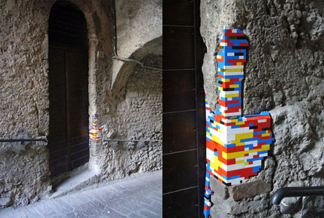
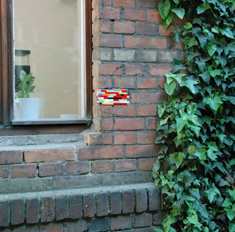
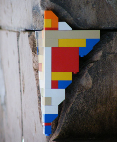
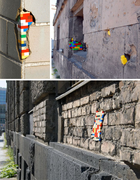
Jan Vormann has taken this architecture, looked at the wear and tear, and filled it in with tiny brightly coloured bricks. Lego, in the place where sometimes century old bricks and other materials have given way to elements and age, taking the old and making it modern. This is an urban art installation makes appearances in Berlin, and its partly highlighting historical buildings (many of the gaps are from World War 2) and partly calling attention to some of the buildings in the city that can use some work. His process is harder then it looks, first Vormann has to find the cracks he wants to fill, an important decision, and a completely subjective one, and then he has to work with the structure of the the crack, using details like corners to fill them all in.
The concept about this is so interesting, using something like Lego and placing it in an environment as opposite as this is beautiful. The juxtaposition of old and new is extremely eye catching, and its something that would make you stop and stare, to figure out just what it is, and how someone could come up with something so creative. And the hidden message behind the bricks, to point out the beauty of the city, its rich heritage and history, while showing the people who maintain the city that there are things that need some TLC is impressive, because really, the Lego draws you in, and the landscape makes you think.
source: www.dornob.com
More cool packaging brought to you by, Andrew Seunghyun Kim...
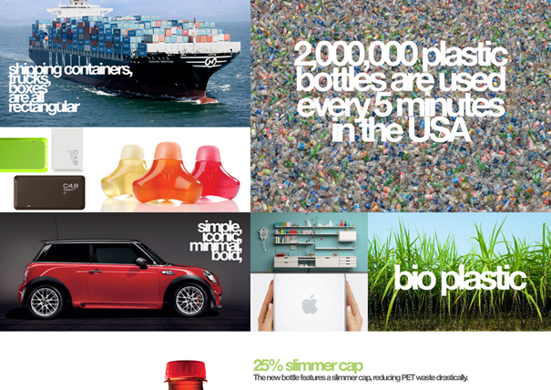
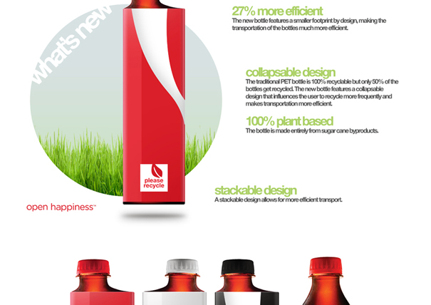
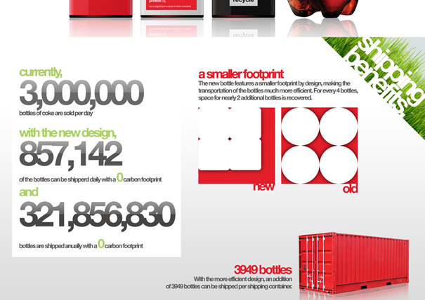
Check this out.. Designer Kim has taken eco-friendly packaging to the next level, I'm just going to post his entire design proposal and let it tell you all the details...
Check this out.. Designer Kim has taken eco-friendly packaging to the next level, I'm just going to post his entire design proposal and let it tell you all the details...
Mixing sustainability with just a really good idea, it really can't get much better... I love the simple genius behind this idea, the new square shape, the slightly offset cap and the crazy smart way they stack together. Every time I see something like this, and idea this cool, I love to make note of it, keep it in the back brain... you never know when this inspiration will come in handy!
source: www.yankodesign.com
Subscribe to:
Comments (Atom)


