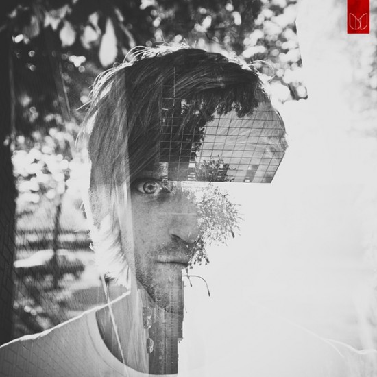
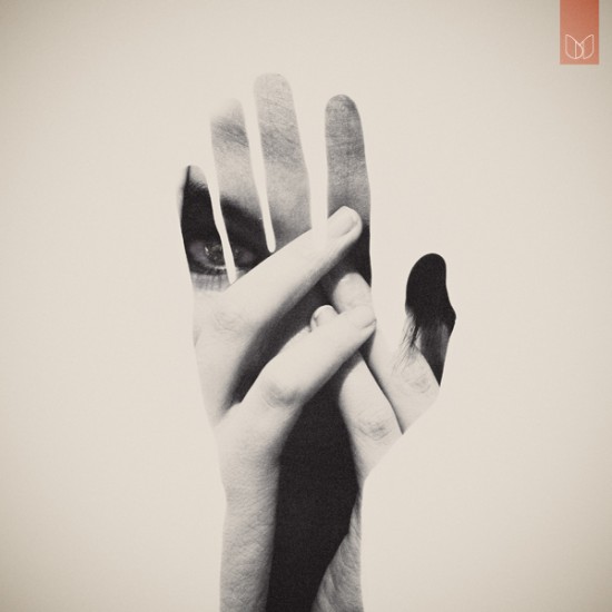
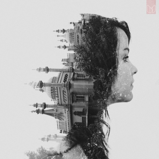
How about a resume?
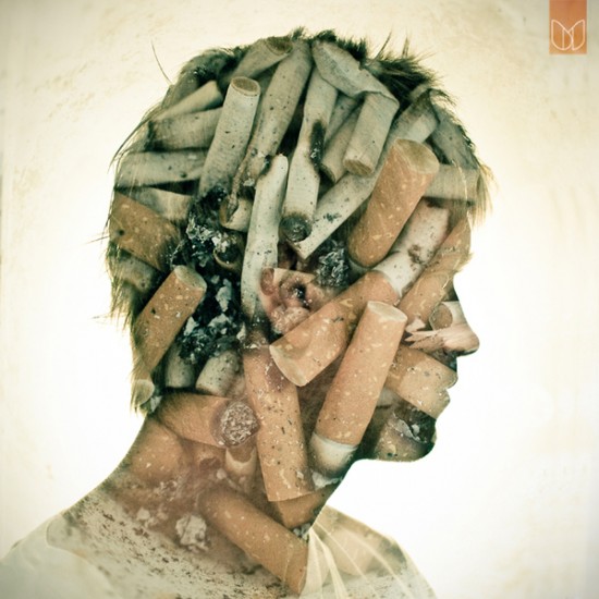
Generally speaking when I think of a resume, I think of the kind most people would show, a piece of paper with a person's experience displayed. After looking at these I'm second guessing the plain old resume I've been handing around for years. Who would just use black type on white paper when you can add so much more to it? I know if someone came and applied to me with a resume like this, I wouldn't just shove it in the pile like I usually do!
I'm going to need to take a break from blogging to re-write my resume now!
Dear Blank, Please Blank
There's always time in the day for some humour to break things up. Jared Wunsch and Hans Johnson have worked together on this project, a series of prints that are available to order, or you can submit your own saying and see it printed and sold if they love it as much as these one. I think the simple design of each of these adds to what they say, some of them are just hilarious.
These just made my day.
Logos are fun...
After hearing feedback from some of the guest speakers we've had in, and a common thread between them is that logo/identity work is something most people want to see when they're interviewing someone or reviewing a portfolio, because it can really show the way you think, and how you design. So what are some cool logos? I found a few that are really interesting, and they've been added to the brain bank for ideas!
There's always room for more inspiration...
(Source: toxel.com)
Which watch?
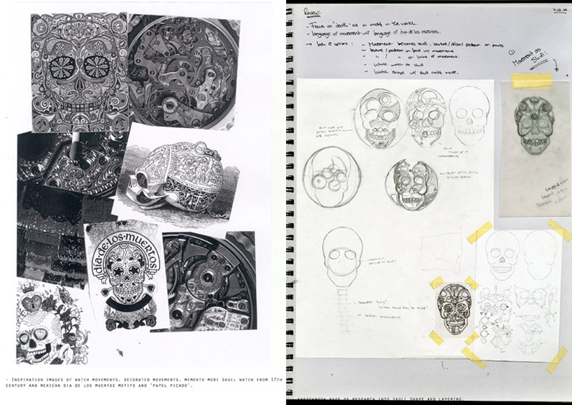
This insane watch was designed by Fiona Kruger, a graduate from ECAL/University of Arts and Design Lausanne, and created this as her thesis project. Her theme was representing mortality in watch making, blending Mexican imagery of Dia de los Muertos and 17th century watch of Queen Mary of Scotts.
The watch face is a human skull full of decorative gold metalwork, formed by layering.
Just look at this watch, it is stunning, every detail on it is so intricate, she took a lot into consideration when she was working on the concept of this one. What I love about this find is the website included her rough work, so you can somewhat follow through her process work, and from what she started with to the end product is amazing. Its nice to get a glimpse into someone else's brain to find out how other designers work through problems, and where they start and what thought they put to get where they did.
This insane watch was designed by Fiona Kruger, a graduate from ECAL/University of Arts and Design Lausanne, and created this as her thesis project. Her theme was representing mortality in watch making, blending Mexican imagery of Dia de los Muertos and 17th century watch of Queen Mary of Scotts.
The watch face is a human skull full of decorative gold metalwork, formed by layering.
Just look at this watch, it is stunning, every detail on it is so intricate, she took a lot into consideration when she was working on the concept of this one. What I love about this find is the website included her rough work, so you can somewhat follow through her process work, and from what she started with to the end product is amazing. Its nice to get a glimpse into someone else's brain to find out how other designers work through problems, and where they start and what thought they put to get where they did.
Now, who's getting me one?
(Source: designboom.com)
Continuing the last post on experimental type, I've found some more! This year I've been spending a lot more time looking for visual research for each of my projects, so before I start anything I spend hours looking for other examples of what I'm trying to do, and we're still going strong on our Calendar, so I'm still searching for more ideas!
This example is made with paper, a 3-D typeface composed entirely of brightly coloured paper cut, folded and rolled to shape each of the letterforms. The designer Sabeena Karnik from Mumbai, India, and everything in these letterforms is made from paper, none of the letters are digitally generated. I love the look of making something that should be digital by hand, the added interest it adds, I spent a while looking at each of these letters because they are so visually interesting.
Take a look at the letters, they are amazing!
This example is made with paper, a 3-D typeface composed entirely of brightly coloured paper cut, folded and rolled to shape each of the letterforms. The designer Sabeena Karnik from Mumbai, India, and everything in these letterforms is made from paper, none of the letters are digitally generated. I love the look of making something that should be digital by hand, the added interest it adds, I spent a while looking at each of these letters because they are so visually interesting.
Take a look at the letters, they are amazing!
Source: dailyinspiration.nl
Speaking of experimental type...
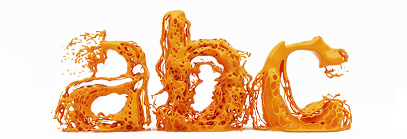
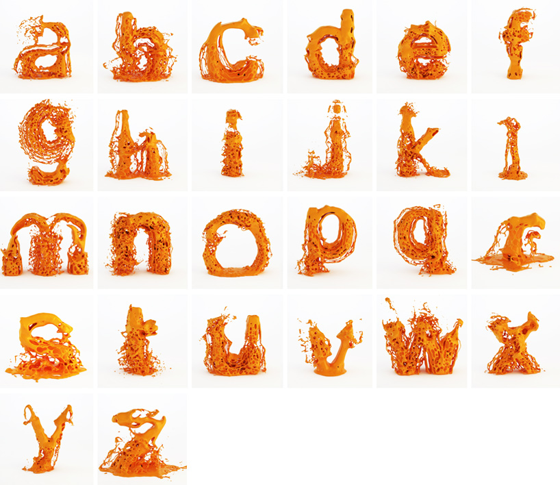
"designed by hussain almossawi of bahraini studio skyrill design, 'fluid type' is conceptualized as a dynamic typeface,
in which each character in addition to being usable as a static letter has its own exploding animation." - designboom
We were just assigned an experimental typography assignment, to make a calendar focusing on type to show each month of the year. So in my visual research I came across this designers take on typography, and it's something I haven's seen before.
One thing that I take from using experimental type is to take an existing typeface and make it something that it's not normally, so taking a simple sans serif typeface and liquifying makes it so much more visually interesting. This new type is not for body text, or to be able to read something, this is add visual interest to your work. It forces the viewer to really look at what you've done and think about what the type actually says. I like the flow of the liquid within the letterforms, and the way it looks like it has just sprung into form. Take a look at some more examples and some videos to show the movement of the actual letters.
"designed by hussain almossawi of bahraini studio skyrill design, 'fluid type' is conceptualized as a dynamic typeface,
in which each character in addition to being usable as a static letter has its own exploding animation." - designboom
We were just assigned an experimental typography assignment, to make a calendar focusing on type to show each month of the year. So in my visual research I came across this designers take on typography, and it's something I haven's seen before.
One thing that I take from using experimental type is to take an existing typeface and make it something that it's not normally, so taking a simple sans serif typeface and liquifying makes it so much more visually interesting. This new type is not for body text, or to be able to read something, this is add visual interest to your work. It forces the viewer to really look at what you've done and think about what the type actually says. I like the flow of the liquid within the letterforms, and the way it looks like it has just sprung into form. Take a look at some more examples and some videos to show the movement of the actual letters.
Have fun looking!
(source: designboom.com)
Vacation house...
After finding the place I will live for most of the year in Thailand, I've found my vacation house in Madrid, Spain. And this one takes that top spot less because of location, and more for design. This house is one hundred percent round, a full 360 throughout the entire design. It is beautiful, and innovative; and another one of the many things that make me ask: Where do I get one?!
Nerdy Dirty, illustrations for nerds in love
This adorable little love illustrations are for the nerd I know is hidden deep inside every single on of us! It reminds me of the Big Bang Theory, the show that gets me through most projects, so it makes me love these even more. I love the use of flat washes of colour, with the small uses of typography in each of them just to add a little bit of humour to each of the illustrations.
source: www.dailyinspiration.nl
wonder-wall.com
Another website to blow your mind... and once you get past the sheer genius of their website design (and its extremely effective distracting techniques... I've been looking at it for an hour now...) you can check out their insanely modern and beautiful interior, architectural and product design. Now, go forth and have fun with this site!
My future house...
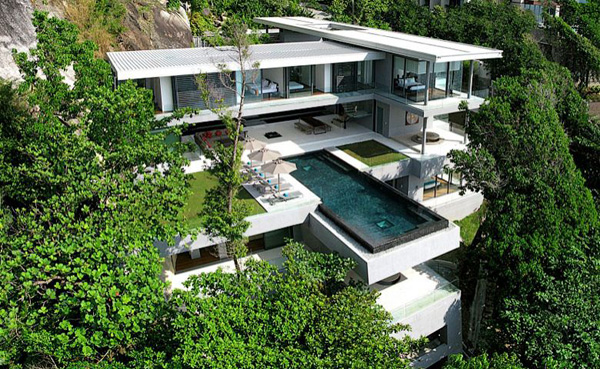
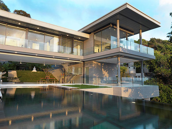
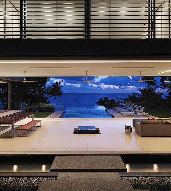
Sorry everyone, I think I'm going to have to leave, I'm moving to Phuket, Thailand. This villa is built into the granite rock face, and shows panoramic views of the Andaman Sea. Modern design at home in natural beauty.
Designed by Adrian McCarroll, Waiman Cheung & Jamie Jamieson.
Sorry everyone, I think I'm going to have to leave, I'm moving to Phuket, Thailand. This villa is built into the granite rock face, and shows panoramic views of the Andaman Sea. Modern design at home in natural beauty.
Designed by Adrian McCarroll, Waiman Cheung & Jamie Jamieson.
source:www.yankodesign.com
Fashion mixed with industrial or geometrical environments is something I respect and enjoy.
It brings the beauty of the person, and what they are wearing to the forefront, while increasing the awareness of thought about the picture. All round, beautiful.
source: www.mladenpenev.net
The evolution of logos
The Apple Logo, revolution. It takes you back to the original logo of Sir Isaac Newton sitting under the apple tree, and I'm sure he had no idea what the apple would become... a multi-billion dollar corporation with some of the best designs out there.
Again, another huge company, all about brand recognition. Its hard to believe that the logo has changed this much, and then gone back to something so similar to the original. The third logo is a shake my head moment, as in what were they really thinking with this, but they brought it back with the next design, and even more so with the most current. It just goes to show you that design follows trends just like everything else: if its good, it will come back into style.
And for my final example of logo evolution... IBM. This just shows a change in name and logo can work together really well. The first two are questionable on their intent, I have a hard time reading them, or getting anything out of them. I'm not sure whether is because I don't recognize the company, but I think it has a nice look with the lines and shapes, but is not effective as a logo. Working from there, the third has a cool concept, but is still hard to read in this small form. Going to the fourth, we are close to the current logo, with the simple use of typography to state the name of the company. I like both the fifth and sixth logo; they are clean and simple and recognizable, just like a logo should be.
source: www.inc.com
Subscribe to:
Posts (Atom)